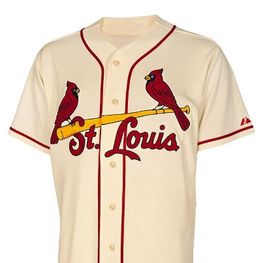
Here’s a nice look at the new alternate home jersey that the St. Louis Cardinals will be wearing for home Saturday games in 2013. It features the iconic “birds on a bat” with the city’s “St. Louis” name, instead of “Cardinals,” for the first time in a gazillion years – and on an off-white cream-colored background that was popular back in the 1940′ and 1950’s – as it was here in our town when the now-fabled “Houston Buffs” proudly roamed these parts as their Texas League farm club.
Check out both of these links and the film clip included in the first one that goes into more detail on the thinking behind these changes. When Mr. DeWitt goes into the background on the reasons for change, the principal reason for these changes goes unstated: The Cardinals have not made any uniform changes since 1998. It’s time to produce something that fans will need to buy.
New Cardinals Uniform Links:
http://blogs.riverfronttimes.com/dailyrft/2012/11/the_cardinals_get_a_new_look.php
Please note that the 11-time World Series Champion Cardinals are not tampering with their “birds on a bat” commitment in this incorporation of “St. Louis” into the mix. The last (and only) time anyone in their front office tried that omission back in the 1940s, the St. Louis native fans came close to storming The Bastille in united protest. And who among us could blame them?
Like the Yankees and their visual bond to the magically crossed “N-Y” letters, those two birds on the bat are the very personification of baseball in St. Louis. Nobody needs to mess with any identity images that are already in place to the “nth” degree of perfection.
Right, Dodgers?
Aside from the Yankees, Cardinals, and Dodgers, what other clubs do you see, if any, that are pretty much untouchable from major change in their uniforms from an established public bond to what’s already in place?
And, yes, we already got the word about three weeks ago: Houston is not on the “untouchables” list, but I do have to give the Astros credit. – Their 2013 uniforms are a nice return to their fundamental look during the early days of the franchise in the Astrodome and I like them a lot over the pajama look of the recent year pinstripes.
What do you guys think?

November 19, 2012 at 2:32 pm |
The Cardinals last had “St. Louis” on their jerseys from 1930 through 1932: road uniforms only in 1930, both sets in 1931 and 1932. The team fared pretty well during that time, winning the pennant in 1930 and the World Series in 1931. The new alternate jerseys are not an exact match for the old; for instance, back then the bat on which the Redbirds sat was black, not yellow.
The last time the Cardinals seriously tinkered with their uniforms was in 1956, when the home and road jerseys just said “Cardinals” in script. Sanity prevailed in 1957, and the the “birds on the bat” were restored.
November 19, 2012 at 4:01 pm |
The Tigers home jerseys with the old English D are a classic that dates back to Ty Cobb.
November 19, 2012 at 6:41 pm |
Al, you made your case. Even Texas guys like me should have remembered Cobb and the famous anglicized “D” that has survived to this day as the very personification of Tigers baseball.
November 20, 2012 at 12:39 am |
Its cool to see it again this way. I’m going into my 2nd year scouting for the Cardinals. As long as that iconic bird and bat is there is what people can identify with.Dick “Lefty” O’Neal